[00:00:00] Nathan Wrigley: Hello there, and welcome once again to the WP Builds podcast. You have reached episode number 365 entitled no script show, episode six, what's the big deal with container queries? It was published on Thursday, the 21st of March, 2024. My name's Nathan Wrigley, and a few bits of housekeeping just before we begin.
If you're interested in what we're doing on WP Builds, make sure to keep up to date by heading to our subscribe page, WP Builds.com forward slash subscribe. Go there, sign up for our emails, so that we can keep in touch with you when we produce a new content. Typically that's a podcast episode, like you're listening to now, on a Thursday. But also the this week in WordPress show, which we record live on a Monday, and then put out as a podcast episode on a Tuesday. If you're interested in that, once more WP Builds.com forward slash subscribe.
The other thing to mention is that periodically we do do things outside of that timetable. You can find out if we're doing anything at our schedule page. That's WP Builds.com forward slash schedule.
And if, like the fine companies that you're about to hear from, you would like to advertise on the WP Builds podcast and get your message out in front of a WordPress specific audience, head to WP Builds.com forward slash advertise.
The WP Builds podcast is brought to you today by GoDaddy Pro. GoDaddy Pro the home of managed WordPress hosting that includes free domain, SSL, and 24 7 support. Bundle that with The Hub by GoDaddy Pro to unlock more free benefits to manage multiple sites in one place, invoice clients, and get 30% off new purchases. You can find out more go.me forward slash WP Builds. Once more go.me forward slash WP Builds.
And I'd like to introduce a new sponsor to the podcast this week. It's Weglot. Weglot the easiest way to translate your WordPress website. The Weglot translation plugin gives you a reliable and easy way to make your WordPress website multi-lingual in minutes. No coding required, and no developer time needed. You can find out more by heading to Weglot.com, once more Weglot.com.
And sincere thanks go to both GoDaddy Pro, and Weglot. I do mean it, it is very deliberate. It's very intentional. I am incredibly grateful to the companies who step up and keep the lights on over at WP Builds.
Right, what have we got for you today? As I said at the top, we are having another no script show episode. Back in oh, I don't know, it was about November 2023, I discontinued doing WP Builds podcast episodes with David Waumsley, but we decided to start a new podcast called the no script show. You can find that at the URL, no script show.
We decided that it would be a nice idea just to give that podcast a bit of a boost and to give the WP Builds audience a bit of an understanding of what we're doing over there. We'd put several episodes, it's probably going to end up at eight episodes, into the WP Builds feed. So this one is all about container queries. I do hope you like it.
We talk about what they are. The whole premise of this new podcast is to shed a light, not on a CMS, but getting back to CSS and the W3C. Web standards for building our websites. And if you've not been following along there is this fabulous. Well, I want to say new, but it's not particularly new thing that you can do with container queries.
So we talk about the significance of container queries and allowing browsers to respond to the container size rather than using viewport widths, which we've been using for ages.
We talked about the potential of replacing media queries with container queries for a much more granular control over responsive designs.
The impact of container queries on component-based design systems, and possibly page builders.
We also explore some practical applications of CSS container queries when designing websites.
And we also consider the implications of using container queries in the context of building web projects.
I hope that you enjoy it. If you do head to WP Builds.com. Search for episode number 365, and please leave us a comment there.
[00:04:48] Nathan Wrigley: Welcome to the No Script show about modern frontend web design, where we look at what we can build today with minimal dependencies and skills.
Today we're talking about CSS container queries. These mark a serious advancement in what browsers will allow us to do, but we are asking what does that mean for us right now? And in order to have that conversation, as always, I'm joined by David Wamsley. How you doing, David?
[00:05:13] David Waumsley: I'm very good. Yeah. You are back telling me how unfit you are feeling, but
[00:05:19] Nathan Wrigley: yes.
Yeah, indeed. I'm, I'm no longer the young sprightly chap I once was, but, anyway, that's our propo of nothing. Let's, let's get on with the show today. CSS container queries, it's all the rage as always. David puts together the show notes and I come along for the ride. I'm learning an awful lot as we're producing these shows, and today was no exception because I genuinely didn't know.
How far the browsers had come. So shall I just pop the screen up? Yeah, absolutely. And take it from there. I'll just quickly say that everything we're about to show on the screen is available on our website, so if there's any points where you are listening to this or watching it on YouTube and you want to know what's going on, the easiest way to find that is to go to the URL as we're on show number six.
It's dead easy. No script show slash six, and that will be the same for every episode. Number six, number seven, number eight, or whatever it may be. So here we are. What's, yeah, what's the big deal with container queries? Tell us, David. Yeah,
[00:06:24] David Waumsley: It's allowed us, this, we must talk about the leading expert on this.
So the person to really get your information from is Miriam Suzanne, who's one of the invited, experts on the CSS working group for this. And she's done a lot of content and a lot of talks. So there are some links, actually the bottom of our show notes, which are two that I think are worth watching.
But the, it's a kind of big deal because it's allowed. Browsers to do something that they, that was considered impossible before because of the nature of browsers. The normal flow, which makes everything responsive by default, could be broken by, querying the container size as opposed to what we've had up to this point, which has been just media queries.
So if we need it to. You be responsive and we need things to display differently in our sizes than we use media queries. Now we've got this opportunity, haven't we? To effectively, we could swap everything to container queries now, right? So yeah.
[00:07:31] Nathan Wrigley: Am I right in saying that if you were to adopt container queries in.
In the most part, you can get rid of media queries. There may be some edge cases where one still might be the best, case, but in most cases, the i the endeavor from now 2024 onwards is to move away from, querying the viewport, the, you know, what I'm talking about? Yes, And move it all over to, container query.
So encapsulating little sections instead of the whole view port. I would say that we're
[00:08:04] David Waumsley: probably not moving to them. We could, but I would say that we're moving much more to this intrinsic thing where, yeah, there's a lot more flexibility with the units that we've got to, not even need to rely on the media queries, but we've got container queries, which according, you watched it as well, the good talk that does, which is containers, what do they know?
And it's on the. 2023 CSS day. Anyway, there's a link on our show notes to that, and she goes into the history about, really, since we got at media queries and we started to go responsive, people were instantly asking for a way to be able to. Change the styles based on the container, and it was considered impossible.
It would create loops within loops. And then there was, and she goes through the history of how that breakthrough came.
[00:08:56] Nathan Wrigley: could you just pause there for a minute because I thought that whole bit about it breaking. Like more or less everything on the internet. This, container query the loops in particular, do you have a full grasp of why that was?
Because this feels like the kind of thing, container queries, it feels like the kind of thing that people have been clamoring for, a decade or more. But the way that everything's been built so far, there was this genuine concern that if container queries were implemented, then there'd be this.
Whole loop of things, which would essentially be recursive and never ending, and it would break almost every website that exists. I don't really understand why that is, but that was a big concern. The browser manufacturers are saying, no, we can't do this. It cannot be done. I. But now it seems to have been figured out.
which is nice.
[00:09:49] David Waumsley: Yeah. And I've only got Miriam's explanation on it. The breakthrough came, they always thought it was impossible because of normal flow. So inline stuff just, goes downwards in the page of the, does the narrow, I. Viewport and it moves down and the idea of containing things in there would break stuff.
It take it outta the loop or cont have loops within loops. And somebody just came up with the fact that we actually can contain the inline size of something and then that kind of opened, it broke the ceiling on this and I really don't understand the technicals of it. But, but we've got it now.
Should we just explain what it, What it is exactly. Yeah. Yes, please. Yeah, go for it. Yeah. there's some, I'm just gonna read out actually the things that are in the show notes. So it is, a way of being able to apply styles to elements based on the size of that elements container rather than the view port.
It is an alternative to media queries, which can only style the elements based on the viewpoint width, which I've said it's a part of the W three CS containment module. Which describes contain properties and its units. So we get a whole bunch of units for sizing things, right? So we get CQW for width.
We get CQH for height. We get CQI for inline cq B for block. we get CQ min and CQ max for min max, size with things. So we get a whole new bunch of units that come with this. The interesting thing I think about it is it's an evolving spec at the moment because, and although this is only behind, as we record this, a flag in Chrome, there is container style queries, which are due to come.
And that is, and this opens up a lot, the ability to style elements based on the containers styles. So this could be a big deal for. Theme in the future, I think. Okay. Yeah.
[00:11:53] Nathan Wrigley: you've just put in there that at the moment, 91% as of March, 2024 of browsers have support for this. I didn't really in look into that in depth, but I'm guessing that 91% encapsulates most of the.
Browsers that most of the people that are using, so Chrome, Firefox, et cetera, edge, so that nine per missing percent is, fairly redundant. I know that it's 9%, which is actually quite a lot, but, have you got an, intuition that. Broadly speaking, you can move over to this without worrying too much.
[00:12:28] David Waumsley: Yeah, I mean it's, I think you can, I think people are, if you don't need to support ie. And, most of the new stuff that we've got, it isn't supported by IE. And it's gonna die up fairly soon. I think some of the issues might be with, safari, on. Some of those can't be updated because they're dependent on the, operating system itself.
So if you need to support some people going back on older iPhones or stuff, that might be a bit of an issue. Okay. but yeah, we should talk about the next thing, really, where we can, what we can do with these things.
[00:13:03] Nathan Wrigley: Yeah. C can I ask, before we do that, can I just smuggle in a question which will lead directly onto this?
I guess it's not even a question, it's just a description. Of how it's different. So in the old world where we were using media queries, the only option that we had available to us was the width of the entire viewport. So yes, broadly speaking, the width of the browser. if it was.
1000 pixels and it dropped down to 900. Somewhere in between that, let's say 950 or something, you could put a media query and you could change the styling, but it's based on that one feature, the width of the, window, for want of a better word, the viewpoint at that exact moment. This opens up. More or less identical functionality, but on a individual part within that viewport.
So it could be, I don't know, a card over here and another card next to it and an image, what have you, a paragraph, anything. So we can, be more refined. We can, instead of just worrying about the whole thing, we can be more refined and adapt things, make them hide, show change, font size, and what have you, based upon the width of that thing.
Within the main viewpoint, and that's the point of it, right? Just it's more granular. It gives us a more. Publisher, Think magazine option.
[00:14:23] David Waumsley: yeah. A absolutely. it does lead to something else. people are very used to using container as the name for something that will mark up in the HDML two style than that.
And now we have to think a little bit about that because Container now has become its own spec, if you like, I think people all often used to call wrappers or containers is what we often use to contain something where. treating that with media queries or just normal flow where It's one extra element. We might need to change our name in a little bit. Now we have container queries where container means something else now, I think.
[00:15:00] Nathan Wrigley: Yeah, and, I guess it's important to point out at this point that container is the really the right word, because you are. You are using the children of a container to go back up the dome and look at something outside of it.
So you know, it might be a paragraph, but you're asking the paragraph to look at its container to figure out what it should be. So it's asking questions of its parents, if you like. Yeah. And presumably
[00:15:27] David Waumsley: it can make any element you want the container for the thing that you are styling,
[00:15:31] Nathan Wrigley: Yeah. So you could go, you could really get granular.
It could, it could, it could go all the way down, couldn't it? Okay, great. Yeah. Sorry, I've interrupted. Carry on.
[00:15:39] David Waumsley: No, and in some ways the examples, and you'll probably bring some up on here, of how people are using, it's the, standard example, I think we've even talked about this before, is the kind of call out card and the MDM records actually has.
If you can pull that up. Yeah. So let me just make
[00:15:55] Nathan Wrigley: sure on the screen if I got the right one. Is it this one you wanted to show at this point or was it the other one? I
[00:16:00] David Waumsley: think it's the other one I think. Yes. Okay. That one. Yes, that's it. okay, there is on the, yeah, nd n records there, the documents there.
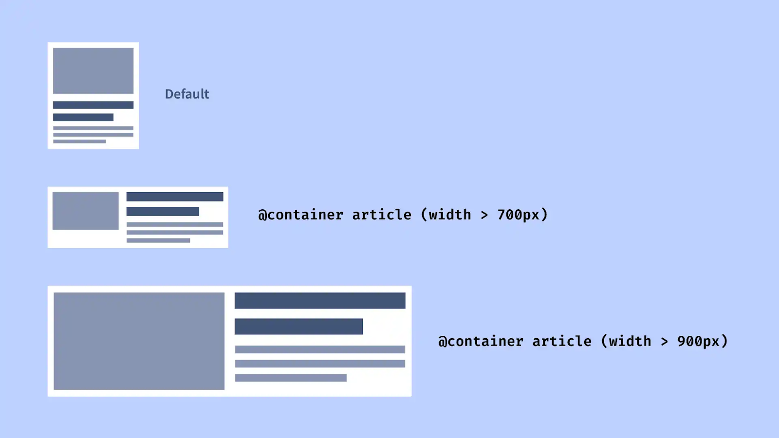
There is a nice example which folks are watching this will be able to see where, this is the card example where you. this is where we're still carrying on with components because now we can change the inline size of a container. We can make the content in that respond to the size that's available to that container.
So what we're seeing on the screen here is a card that when it's got the room, we may have the image over to one side and a title to the right off that with some. Copy and maybe a button. But if that container then needs to move into a sidebar with less space or another design entirely where it has less space, then it will adapt.
So this is adapting where it's got smaller space. So the image is going on the top on this example, the. Main body text has disappeared. 'cause there isn't the space, it's just leaving the title and the button. And I think that's probably the, did I explain that well? I dunno.
[00:17:05] Nathan Wrigley: Yeah. Yeah. I guess if you're listening to this and there's no audio, it's exactly as David said.
I think the, yeah, the fact that the text disappears, it's probably the key thing here, isn't it? In that we're quite used to seeing something like this, image left. Title, right body, right bottom below, all of that. That's a fairly common layout. And then as it collapses before the, whole layout changes to be entirely vertical.
At some point, the intuition is now the text is just occupying too much space. We, want the image to be occupying the full height of the card. So now the text has taken up too much room. So let's just. Get rid of the text so that the bottom doesn't look like it's floating in its own space. And, it's fairly, it's a fairly simple demonstration, but it works really well.
We'll, put the links into the show notes. Yeah. But this is, yeah. And
[00:17:53] David Waumsley: yeah. And then a couple of similar examples with the same idea is a weather widget where you might have the days of the week where you're saying it's suddenly on these. Days and that if you've got the space for it, then you're going to show these horizontally.
If it needs to go in a sidebar, it, you would have to create for that sidebar before we got container queries, a whole new setup. But here you can take one style at once and say, make it behave like this if it's in a smaller space, and then it may stack horizontally or lose some of the stuff. And we've seen that as well.
And it's used, on some designs where we may have a button. that will have text and an icon and then when it's got less space, it's just got the text. And when it's got even less space, it's just got the icon. So we could build those in with a container query rather than a media query and have that place wherever we like in our design.
So it's this idea of this modularity where we can Bring these things into different designs and create our components out of it.
[00:18:52] Nathan Wrigley: Yeah, I guess, the example that's on the screen, and again, apologies to those people listening. You can imagine that being repeated, I don't know, in a three by three grid or something, where you've got three of these similar cards next to each other, but then of course on a news website, you may want a more or less identical card to keep.
Some attributes on the page. You, for example, you may wanna keep the body text, because it's the headline, it's the most important thing on the page. So at the beginning, it looks like everything else, but as you collapse it, it doesn't lose the same features. And because it's a container query rather than a view port query, it can behave in its own unique way, than all the other ones in the main grid, if you like.
So the first item could behave differently to the second, third, and fourth and, so on. yeah.
[00:19:38] David Waumsley: And you've got tab as well for another example, which again is on MD ed by, wonderful Michelle Barker, who's created a good explanation of this. And I don't know if, for those who can see it, that makes a lot of sense.
But I think the big deal is if you've got a news site where maybe previously you would have certain news in a sidebar, and if you were using the view port widths, then you would need to treat that sidebar. Would have to move as you lost space, right? But here, what we can do within the sidebar, we can put those in containers and have them independently changed to the content that might be in the main section area.
So a new site, it gives you so many different ways that you could treat those individual cards. they could be changing within the sidebar based on the container, not the view port, and also the main content area Could be styling some of those cards independently of that, and I think that's the big deal.
[00:20:35] Nathan Wrigley: Yeah, it's a pretty profound design actually. I really like it. the styling is incredibly basic just to illustrate what's going on. But again. The links will be in the show notes, but what you're seeing is a little bit what I just like what I just described, where you've got this main headline article, which when it's in, let's call it desktop, we're gonna have to stop using those, terms, aren't we?
where, when it's in the, widest possible view, you've got one article. Occupying like the headline space, and then beneath it, there's two more, and then beneath that, there's four more. And as it collapses, it goes to one main and then two. But the orientation of the ones underneath it change. And then obviously as you collapse it to what we might describe as a mobile view, everything stacks and looks identical.
the only difference is that ones are higher up on the page, but the styling is identical for all of them. So it really offers you an opportunity to make. For those people who've got the space on their screen to make things stand out. And then where you don't have the space just to make things look more or less like a list.
it's really nice and very profound. yeah. Yeah. Yeah.
[00:21:37] David Waumsley: I think with a news like that, if I had a sidebar, which isn't really showing on the example we're looking at on the screen here, but it, I would imagine that if I wanted to keep the sidebar fixed quite small and compared two. The main content as it gets smaller, I might just turn these into links and get rid of all of the images independently in the sidebar, allowing more space in the main content area.
Yeah, you couldn't do that independently before, so it does allow for that. But I know again. It's little
[00:22:06] Nathan Wrigley: intuitions like that, isn't it? The more that, you explore this and the more that you think about this, the more that these things occur to you. You know what to do with the sidebar?
Oh, I could try that now. As opposed to in the past it was just, that's not possible. Okay. shall I take that off the screen or is there some, something else?
[00:22:21] David Waumsley: Yeah, take it off the, we can go back to notes. There was one more thing actually that I thought was a very cool example of what you could do with it, and that is because you.
With SVGs, it's part of standards as well. Oh, we could make that a container and play, apply some of the sizes, styles to that. So in the example of a logo, it would be possible where you need that to be a rectangular logo laid out in a certain way. Have it when you've got that space, do that and then have it go to what a, a square with some of the elements in that logo changing or arranging themselves differently.
According to the space available. And I think that's quite cool because you might, so
[00:23:00] Nathan Wrigley: just, to pick that apart, because an SVG is, a document basically. So it is got, it's got, the component parts. It's not just a flat image of, it's, just data and the browser passes it and figures out how to display that data.
This is, it's a document, so it's made up of little bits. And because of that, you can query those little bits. And a perfect example, you just said you're on a desktop, you've got a main navigation at the top, and you want a flat, rectangular letterbox style logo. But as you collapse it, it might be better to just have a centralized square logo.
And so you can do that on an SVG level. So you modify the actual. Image. It's not like you're swapping one image for a different one. You are actually modifying it. You can imagine people getting really granular with that so that as the browser is collapsed incrementally, the logo kind of morphs and moves around and little parts of it.
imagine you've got a logo with three circles and they're in a triangle at the beginning, and you want 'em to all be in, in a horizontal line. You can imagine them being pulled out slowly, like an animation you might see. Yeah, that's fun. That's a really interesting idea.
[00:24:11] David Waumsley: Yeah, I thought, I've not seen, only a very basic example of that on Code Pen, but I think, yeah, something to explore.
It might take a lot of time, but the idea of this portable logo that will display the way you want it to display wherever it goes. Just, but you can
[00:24:25] Nathan Wrigley: imagine tools like Illustrator taking that work on for you. You can't, you where you get an option to have it. Have it, in this orientation and even have that, the animation bit taken care of.
So if it's this width, we want that one to eventually end up over there. And the, software will figure out the percentages that it's got to work through to get it to, to get to that point in the correct amount of time. Anyway, I'm totally off piece now. I'm, but, fascinating. Fascinating. Okay.
we get excited about it. Should we
[00:24:53] David Waumsley: pull some cold water overall? Oh.
This is quite, the interesting thing for me, I think, I mean I'll put that in the show notes, you may disagree. I think the people who are gonna be most interested in this or need to be thinking about it is the people who are doing component based, design systems, which I don't think I'll be investing that time in that particularly.
But if you are looking that way, particularly with the idea of style queries, and theme that might go on. So I think those people who are building those systems. We'll probably start to need to think about these things. And also maybe page builders or CSS frameworks, they might change their na. Then probably need to start thinking about how they might be able to use this.
Because I think it is a bit of a, I hate to use the word game changer, Oh, I, actually think the interesting thing is from my own personals. Perspective. I don't know if I would invest that much time in this. I think I, and I put their little quote in it. It's behind, a paywall. this is Hayden Picker and Andy Bell from every layout dev.
And, I saw that quote and I think it sums up where I've gone with this. So they say, What layout problems do container query solve? This simple answer is any for which an intrinsically sound layout cannot easily be devised. I misread that, but same point and I thought, yeah, that's where I've gone. To be honest, there's been so much stuff in CSS that so many ways that we can not have to rely on query and stuff that we can build in flexibility with these.
Intrinsic methods that I would put all my efforts into that before I moved into some of this clever stuff that we can do with container queries. So that's where I found myself with this.
[00:26:53] Nathan Wrigley: Yeah, I can imagine that. we, so we were looking, before we hit record at a variety of UK news website. So we looked at the BBC and the Guardian, and they, although my intuition, or your intuition I think was that they're probably not using, this.
at the moment they're probably using, the viewport and media queries and what have you. You can really see how this stuff would map well, but it would require quite a lot of backend CSS engineering, in order to make it work. But once you've set that up, then it'll work beautifully on absolutely every device, and it'll take away a lot of headaches and everything will be really straightforward.
But there will be. A lot of work to get that working. Yes. And the websites that you are building, maybe the client doesn't have the budget for that. Maybe the client just doesn't have that much content. It's gonna be a much more, header, hero image and then a main section. And, and it doesn't really fit into that.
All you need to do is collapse the text and collapse the content. So it might be a bit of overkill, but we're after a, sorry, You go.
[00:28:02] David Waumsley: Oh, no, I, was just gonna say, Suzanne is almost the perfect person to describe what happens, so you can invest a lot of time on the perfect system.
She created a framework called Susie, of which of course, she says today, please don't use my framework. Use the modern CSS. So we've always got that, and it's how much you're going to invest to save some time on your future projects against when that might need to change because you've. Saddled yourself to some kind of framework.
And most of the time I'm styling documents, mostly text, and I can get with intrinsic methods. So I can see how this is more important than probably a, although I got excited and thought I must need to know this inside out, I've realized that I need to know a lot more about CSS inside out and how I can avoid it.
And I think things like every layout, which is a way of simplifying as best as you can, using the less CSS to give your responsive. You meet your responsive needs. Using the least possible is the kind of approach that I've decided to go with this. There is one interesting thing, and I dunno if I actually put it on the show notes I should have done, but there was an interesting tweet, that was going out on X and it was by.
Kravitz. Okay. She's a Google person who talks a lot on CSS, really clever person. She was asking, when are people using, are you using container queries? And I've not even thought about this before, but a couple of people replied, no, because we can't, we haven't got responsive images for it. They are still based, oh.
On the media queries and I thought, I've not even thought about that. And I thought, yes, it is a bit of a holdup on the moment for that. Okay. Yeah, that is a bit of a holdup.
[00:29:41] Nathan Wrigley: That's interesting. Yeah. I do think the page builder crowd, you can well imagine that there must be quite a lot of talk and excitement in that space about this.
I don't know quite how you would, in a visual way describe all of the different ways it's gonna. collapse when the view port collapses. 'cause obviously each little part will be different or how they'd set that, that up in the ui. But their page builders are always looking for the next interesting thing, aren't they?
To set themselves apart from their competitors and to also just make it so that you can have everything done in a u, in a. Gooey, it does feel like this is a good place for them to go. yes, we're both from the WordPress space, so we understand, the limitations of some of those different technologies.
But ha, having, describing how that works will be interesting. rather than having a, a static image to show what that layout will look like. You might need something like, I don't know, an animated, web P image or something like that to show how it will collapse, but I think that's.
I'm sure that'll be an area for growth in the future. Throw in grid. Yeah, throw in all of this and it'll be really interesting.
[00:30:50] David Waumsley: I absolutely, I think, if theming comes with that, with the styles and being able to size things where somebody can grab and that's, things like WordPress are very much about building these reusable patterns and the idea that you can just sling them where you like and it'll adapt is a, real plus.
But, yeah, that I. That's really, I think, all we can say on this. Yeah. Yeah. It's a
[00:31:10] Nathan Wrigley: fascinating new technology and it's in a browser, probably that you are using at the moment, so you can start exploring it. The links, as I said, will be in the show notes. It sounds David, as if you might be throwing Uma's link in, to add it to the ones that we've got at the moment.
But all the videos that we described and all of the different things that we raised on the screen. I'll be on the, the website, no script show. Yeah. And in this case slash number six. So yeah, I think we've done it. That was a, nice brief one.
[00:31:42] David Waumsley: Yeah. Next time I think we'll be talking, it's about time.
We're gonna, I think, break from what we intended to do, which was to cover all the new features in CSS and HDML. But I think we need to have a break so we can talk about how we're going to design this website that's already out there.
[00:31:57] Nathan Wrigley: Yes. Which needs, who you wanted to do a good deal of TLC? Yeah. Yeah.
we keep forgetting to mention that the website is gonna be, under David's purview 'cause he's far more clever than I am. And, as we go through subjects, David's gonna try and implement something of that. Into the website. So we haven't covered a great deal that can be implemented thus far, but that'll come and hopefully, in the year 2029, the website will look absolutely fabulous.
[00:32:26] David Waumsley: So I think next time we're gonna be talking about, how do we start a web project? I know we've already started this one, but that's what, we'll discuss the next one. So I hope people will join us for that.
[00:32:36] Nathan Wrigley: Great. we're done. We've wrapped up episode six. We will see you on episode seven.
Thanks, David. Nice chatting to you again.
Well, I hope that you enjoyed that. Always a pleasure chatting to David Waumsley, who as you've probably realized by now is no longer part of the main WP Builds show, but we did think it would be nice to give the no script show a bit of a boost at its inception. So we're probably going to plug about eight episodes of that new show in to the main WP Builds feed. We're on episode six, so probably two more of those episodes to go.
After that, it will be released into the wild and you'll be able to find it through your podcast player of choice. You can subscribe to that by heading to no script.show, and search for links over there.
Meanwhile, if you're into subscribing head to WP Builds.com forward slash subscribe, and you can do the same for this podcast.
If you've got any comments about what we said on the show, the easiest place at the moment to go is to WP Builds.com. Search for episode number 365, and leave us a message over there.
The WP Builds podcast is brought to you today by GoDaddy Pro. GoDaddy Pro the home of managed WordPress hosting that includes free domain, SSL, and 24 7 support. Bundle that with The Hub by GoDaddy Pro to unlock more free benefits to manage multiple sites in one place, invoice clients, and get 30% off new purchases. You can find out more go.me forward slash WP Builds. Once more go.me forward slash WP Builds.
And also a new sponsor, which is Weglot. Weglot the easiest way to translate your WordPress website. The Weglot translation plugin gives you a reliable and easy way to make your WordPress website multi-lingual in minutes. No coding required, and no developer time needed. You can find out more by heading to Weglot.com, once more Weglot.com.
I really would like to express my sincere thanks to both GoDaddy Pro who've been sponsoring us for absolutely ages, but also to Weglot for jumping on board and helping us keep the lights on over at WP builds.
Okay. That's all I've got for you this week. I really hope that you enjoyed it. Share it as much as you like on your social media platforms. We'd really appreciate that. Feel free to subscribe as well. We'd love that as well.
We'll be back next week and it will be an interview episode. But for now I'm going to fade in some cheesy music and say, stay safe, have a good week. Bye-bye for now.